I am so excited to show you the results of the collaboration between Sarah of Hip Ink’s studio and mine (see post on sketches awhile back here). We do create custom illustrations on request for specialty purposes outside the studio but this is the first one that is actually a wedding invitation, and it was so much fun to do!
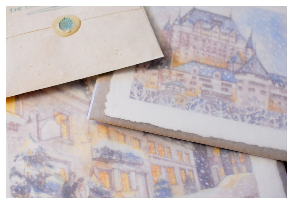
(Image above: Originals wrapped in glassine ready to be shipped out to the client in Canada.) I love the romantic, wintry wedding setting in Chateau Frontenac, Quebec City. When Sarah and Lorrain first showed me pictures of the venue and time of year, I instantly fell in love with the idea and couldn’t resist visions of vintage watercolor illustrations of the 1800s with their cobbled town streets, horse and carriage, women in fur coats and men in top hats! I envisioned it as an evening scene blanketed in snowflakes with an almost ethereal feel from another time, the warm glow of light from indoors bathing the sidewalks sparkling with snow.
HIP INK has a modern, clean and delightfully fresh approach to invitations and stationery in a style that is very different from mine and I was really excited to see what Sarah’s approach was going to be in the final suite. It was worth the wait-I love the gorgeous letterpress and combination of fonts that she chose and the paper is simply beautiful, thick and luxurious! All in all, a really elegant, classic, timeless suite that her clients must have been thrilled with, great job Sarah!!
Here’s what Sarah has to say…
(Excerpted from her HIP INK blog post, photo captions are my own thoughts)
Danielle and Stephen’s Chateau Frontenac/Old Quebec winter-themed pocketfold invitation, featuring a mix of letterpress printing and beautiful hand-painted illustrations by Amy Tan of The TreeSpace Studio.
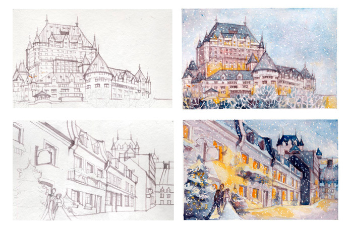
They were immediately drawn to our Paris invitation at a bridal show in January, and knew they wanted something with a similar feeling, that would incorporate two specific illustrations – one of the Fairmont Le Cheateau Frontenac (where Danielle and Stephen’s wedding was taking place) and one of a wintery streetscape of Old Quebec. They wanted something soft and romantic, with a pen and ink/watercolour feeling, and I knew exactly who to call – in fact, I remember blurting out in our first meeting, “I know the perfect illustrator!”.
The perfect illustrator was Amy Tan from The Treespace Studio – Amy is an invitation designer in her own right as well, creating some of the most personal and beautiful invitations out there, and I knew her amazing style was perfect for this project (and I was right!).
We had used letterpress to create Danielle and Stephen’s save-the-dates, and I thought it was the perfect mix of modern and old-world for the wedding invitation as well. But…I knew that letterpress was definitely not going to work for the illustration portion of the invite. So, just like peanut butter and jelly, we made two very different printing methods the best of friends – first we sent off the invites and inserts to be letterpress printed (on Crane Lettra cotton stock), and then once we had them in studio we reproduced Amy’s beautiful illustrations on our in-house photo printer (and I caught up on Pinterest while I hand fed each one!). And here is the result:
The illustrations so beautifully captured the Chateau in winter, with a warm glow emanating from the windows and a snowy Old Quebec street scene, with the bride and groom making a special appearance.
While the colour scheme was a very traditional silver, white and dark blue, we added in shades of lavender to both the illustrations and the belly band, as well as the warm yellow-orange that added warmth to the illustrations and overall piece. Read the rest of the post here on Sarah’s HIP INK blog!


