My most beloved readers, this is a post I’ve been wanting to write for a long time-to share with you the single, most important value guiding my work as an artist and designer-the concept of elegant imperfection.

Wabi Sabi
(the philosophy behind Japanese traditional beauty):
“Wabi Sabi is a beauty of things imperfect, impermanent and incomplete.
It is a beauty of things modest and humble.
It is a beauty of things unconventional.”
-from the book ‘Wabi Sabi for Artists, Designers, Poets and Philosophers’.
While I don’t claim to embody all the virtues of true wabi-sabi, the concept of letting the nature of something shine through in all its elegantly imperfect glory, whether it is yours or a hand-crafted piece, is the life and muse behind how I create. It’s something I truly, deeply believe in, not only as a designer, but as a human being. To not slick things over, Wacom-digitize it to perfection, or magic-erase every blemish. YOU are special, all your flaws and idiosyncrasies and messiness included.
Why elegance? Because wabi-sabi is beyond just rustic.It is the graceful acceptance of imperfection.
What most people don’t know about me when they first encounter my work is that I was a hard core modernist in architecture school and for most of my earlier professional life as an architect. Heavy-handed hard straight lines, clean modern design, every detail drafted within an inch of perfection. It’s not unusual, I was trained as an architect and precision was drilled into everything we did.
Ironically, it was also how I first encountered the concept of wabi sabi. While reading books on Japanese art and architecture to prepare for design projects, it planted a seed in me, like a pea in the bottom of a stack of mattresses and I’ve never ‘slept’ well since. Architecture in its popular manifestation disturbed me-the picture perfect magazine look, not a speck in place, no clutter, the obsession with ideology and perfection.
This was one of the reasons why I crossed over to the world of art and why I practice design the way I do, because unlike in architecture, there is room for cracks, for surfaces that don’t line up, for messiness.
I truly believe we inhabit a world today obsessed with perfection and outward beauty. It is cracking, and there are movements that show this, but it is still there, deeply ingrained, like the 1980’s legacy of perfect white teeth.
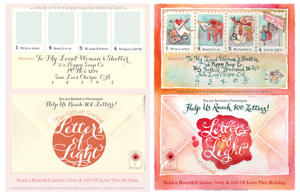
Here are two examples: progress proofs from my own re-brand and of a holiday campaign for Poppy Soap Co. The left shows an all-digital design. The right is how it looks like now, after adding personal hand-touches. Which do you think feels more human and approachable?
Here’s a little perfection-compass to try out with your little boutique biz:
- Are you obsessed with perfection? Is your brand so slickly designed it leaves no room for the loving, complex individual that you are? Can you show your goofy side or reveal the hopeless romantic you are in your design, videos or posts?
- Are you alienating your ideal clients because they can’t emote with just beautifully composed but empty imagery and messages? How can you bring soul to your brand identity?
- How can you be MORE vulnerable and MORE yourself in the way you communicate your {brand} story? Can you write more heartfelt newsletters and blog posts? Can you reveal more of your charming quirks? Can your photos show more YOU and less how you SHOULD be?
Your folks are not connecting with your ‘brand’, they are connecting with YOU.
Have courage to be imperfect and vulnerable and sparkling with personality.
……………………………………….
Do you need help brainstorming how to let your elegant imperfection shine through? Join me for a creative brand-to-design adventure :


