Nick originally wanted letterpress-ed invitations on a simple, rectangular classy card to go with the elegant wood-panelled banquet halls in the exclusive English-styled club where the wedding dinner would take place. After a tricky bout with printers and concern over time, budget and quality, he wanted to explore possible alternatives and presented me with his dilemma.
Early inspirational images included highly textured Victorian high couture wedding gowns his wife would be wearing and it was immediately apparent that texture and class was going to be important. Further chats with Nick revealed a fantastical almost avant-garde taste in design, objects and photography, with a hint of nostalgia. Some of the later images I received included all-white doily button bouquets, pastel-toned posies, vintage-high fashion style wedding photography and our very own ‘dream BIG’ cards.
It became evident that materials, a tightly simple and bold composition as well as font design appeared to be important factors for this practicing architect when it comes to his invitations. He also favored the whimsicality of the ‘dream BIG’ watercolor illustrations and textures of some of the materials we have used. This combination proved to be very challenging indeed.
After some thought I knew I wanted to feature a simple and lovely illustration that was important to Nick and his wife. I also felt that Fate, which featured strongly in their background story would be a very interesting design concept. (Nick met his wife’s parents while on vacation 3 years before he met her and didn’t realize this until 3 months into their relationship! )
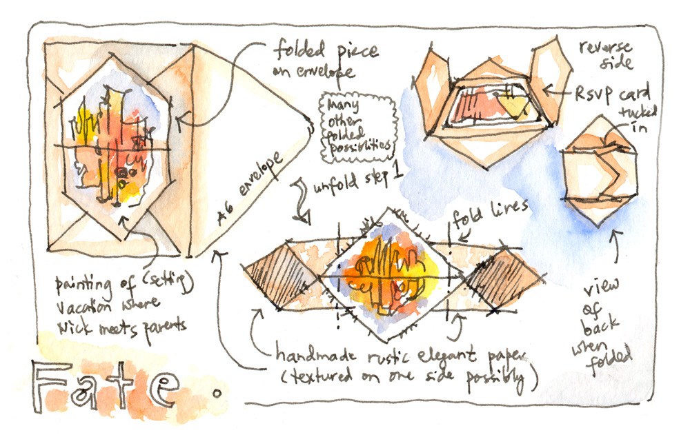
I wanted the invitation to be very unique and unexpected, with a main painting that is simple and bold. It needed to have a simple yet rustic elegance that would fit within their wedding dinner venue and have a modern yet timeless feel. The resulting concept is inspired by origami paper-folds and traditional European letterfolds. The main invite is folded from a 8.5″ square of textured handmade paper (many choices to choose from with single sided textures or similar on both sides) into what looks like a diamond shaped item with a painting across its single seam. The featured painting would be an abstraction of the vacation setting where Nick met his wife’s parents, when Fate intervened.
On the back of the folded invite, its long side tabs hold close a little RSVP card, sized as a small postcard with a simple painting on the reverse of the Bankers’ wood paneled rooms and single unusual chandelier- space included for a personal note to the lucky couple.
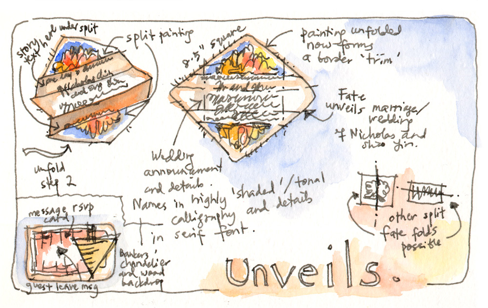
Once the invite is completely unfolded, the painting splits revealing the main text of the wedding invitation, names written in highly shading (or gradating) ink and details printed in serif font. The painting has now become almost a border trim for the invitation, and a little line of text that runs below it tells the simple fateful tale that has brought upon the wedding. This fold is just one example, other possible folds with the same concept of two fated halves/souls coming together is possible and can be explored!


