Happy Monday all!
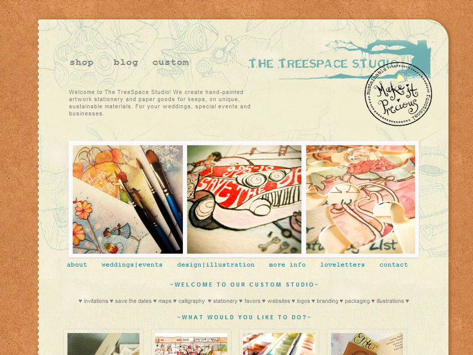
This has been brewing for awhile, I have always wanted the landing/homepage of our website to be a little clearer and more friendly to visitors. Having created everything on Thesis, it is a breeze to change! Here is a first look at it, the shop portion is temporary and we are looking to Big Cartel but that is in the works.
The first thing you’ll notice is that the clunky text menu on the left is GONE! Now there is a new nav menu (my favorite new feature) under the new slideshow which links to our gallery, and then four thumbnails below that helps you navigate the site based on what you want to know or see.
Another new feature is something I am excited about-the Featured Project section! Now you’ll be able to see all the latest goings-on and special news we have right on the website homepage!
Another big change is that we will no longer have a separate landing splash page. I felt it was unnecessary and the streamlining of the studio into the Shop, Custom Studio and Blog makes things pretty clear enough.
What do you think? Thoughts, comments and suggestions welcomed! Stay tuned for Part 2 for the new shop launch and new products.

